RGG Tattoo Study


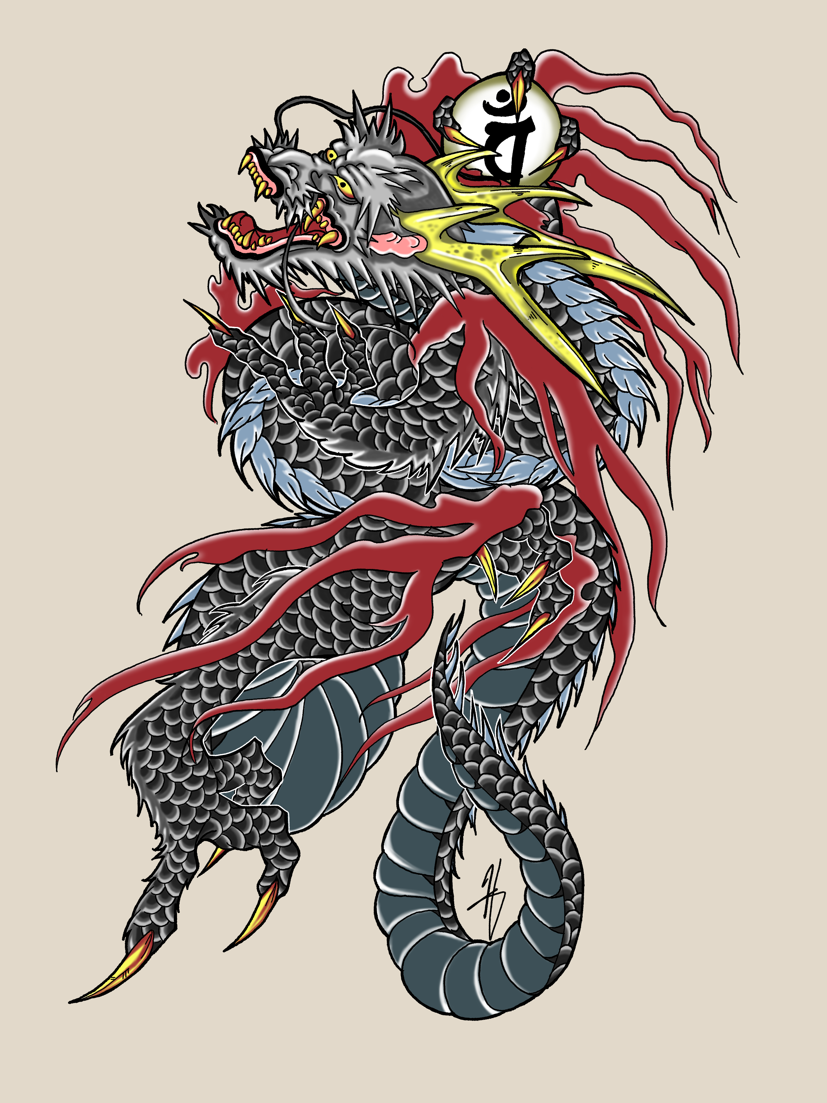
This took... ages. A couple weeks of work off and on as I wondered if it was worth the
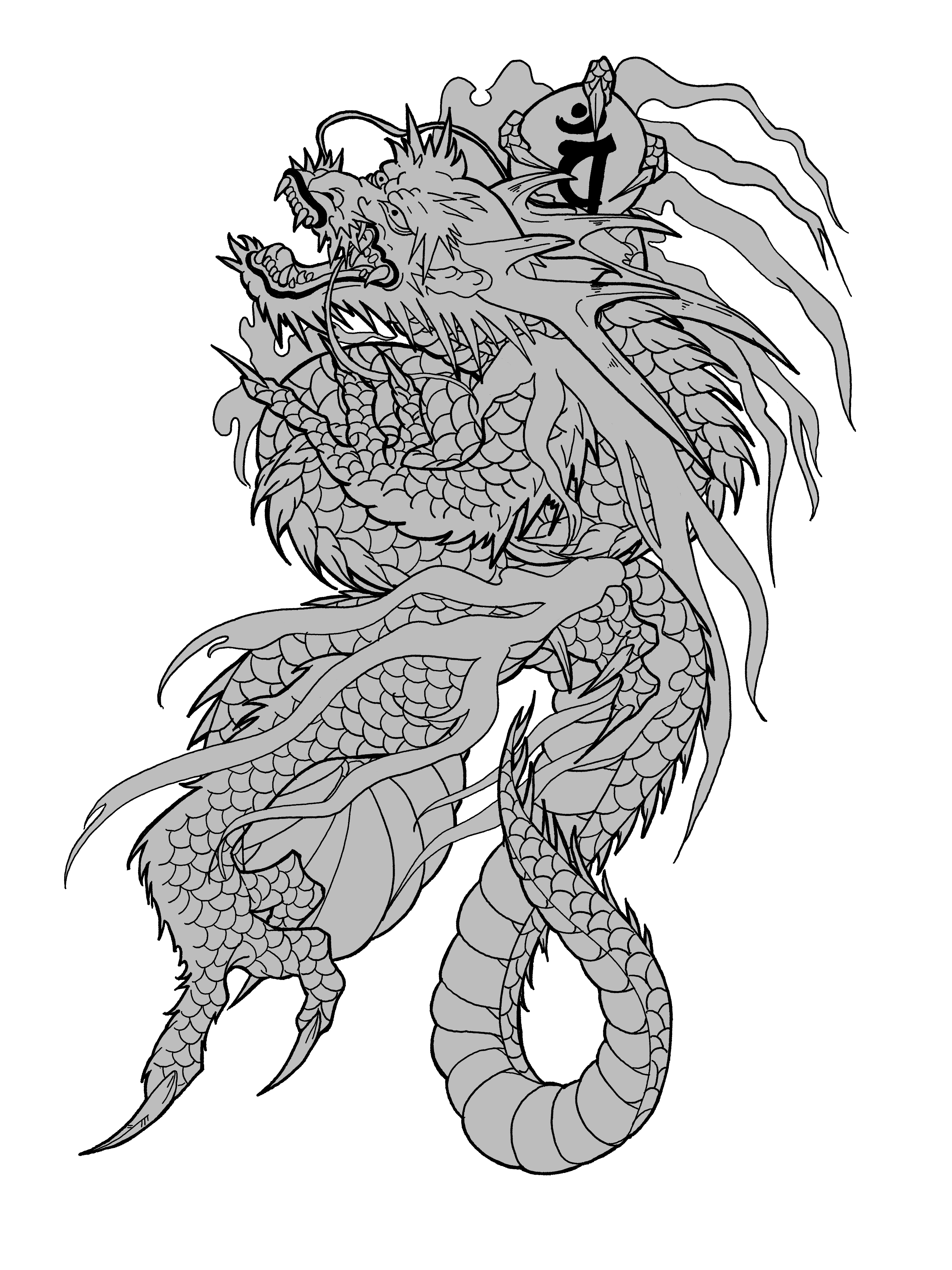
effort- and it was. I simply needed to figure out a work flow. I tampered a bit with my lining
pens and used a completely different brush than usual for colouring since I wanted to do this
with no blending which I tend to rely on a lot in my digital work.
This is of course, Kiryuu's tattoo. His dragon is in such a weird position and I had to first try
to figure out the torse and how it's posed before adding the limbs. You can tell even though its
the same tattoo design its off in a few places since I was doing it by eye.
I have a timelapse of this luckily but I need to convert it to a gif so I can upload it onto
here. Also why do dragons have human noses....
May 2024
Back to the Top
Loose Ends Part 2
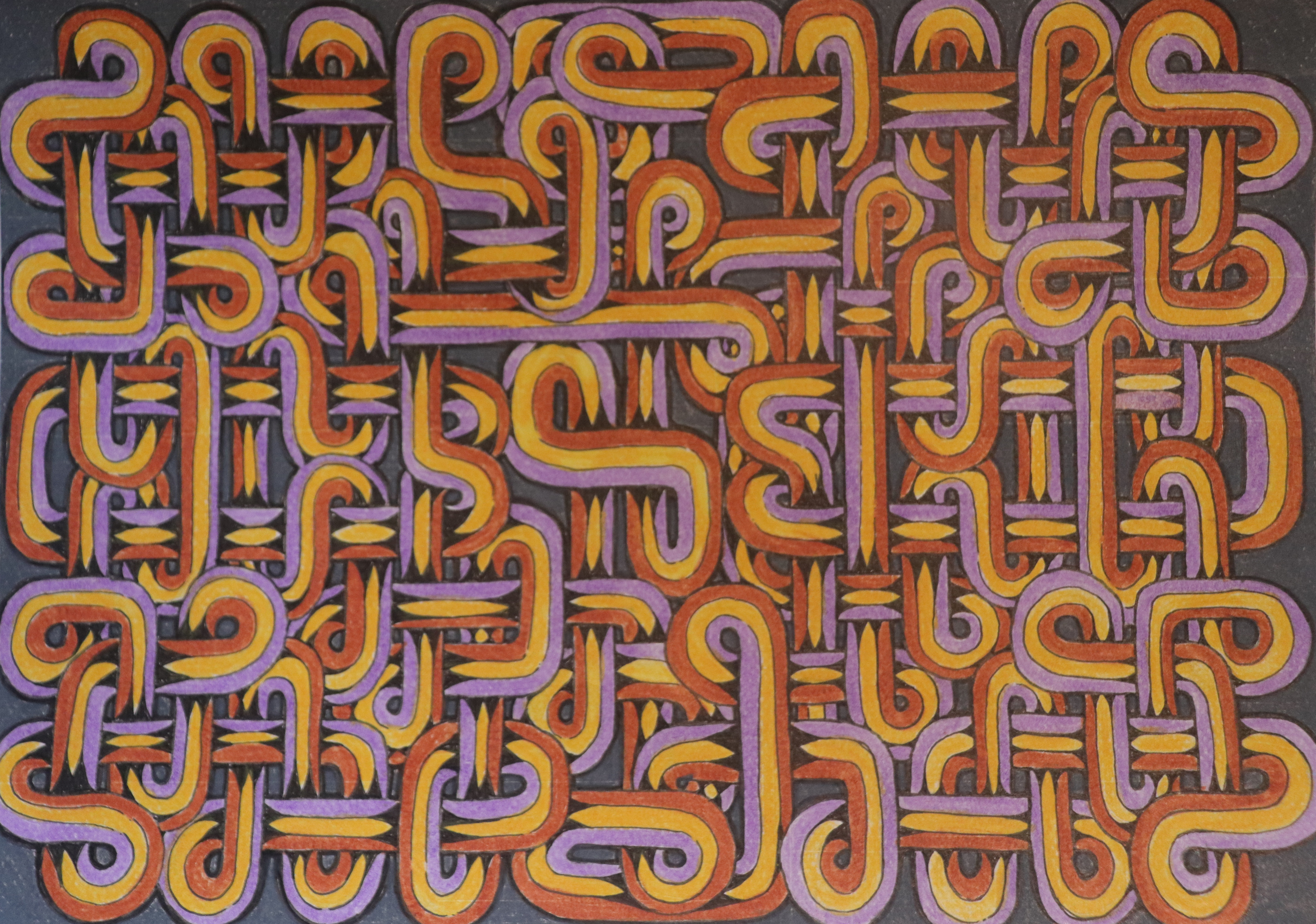
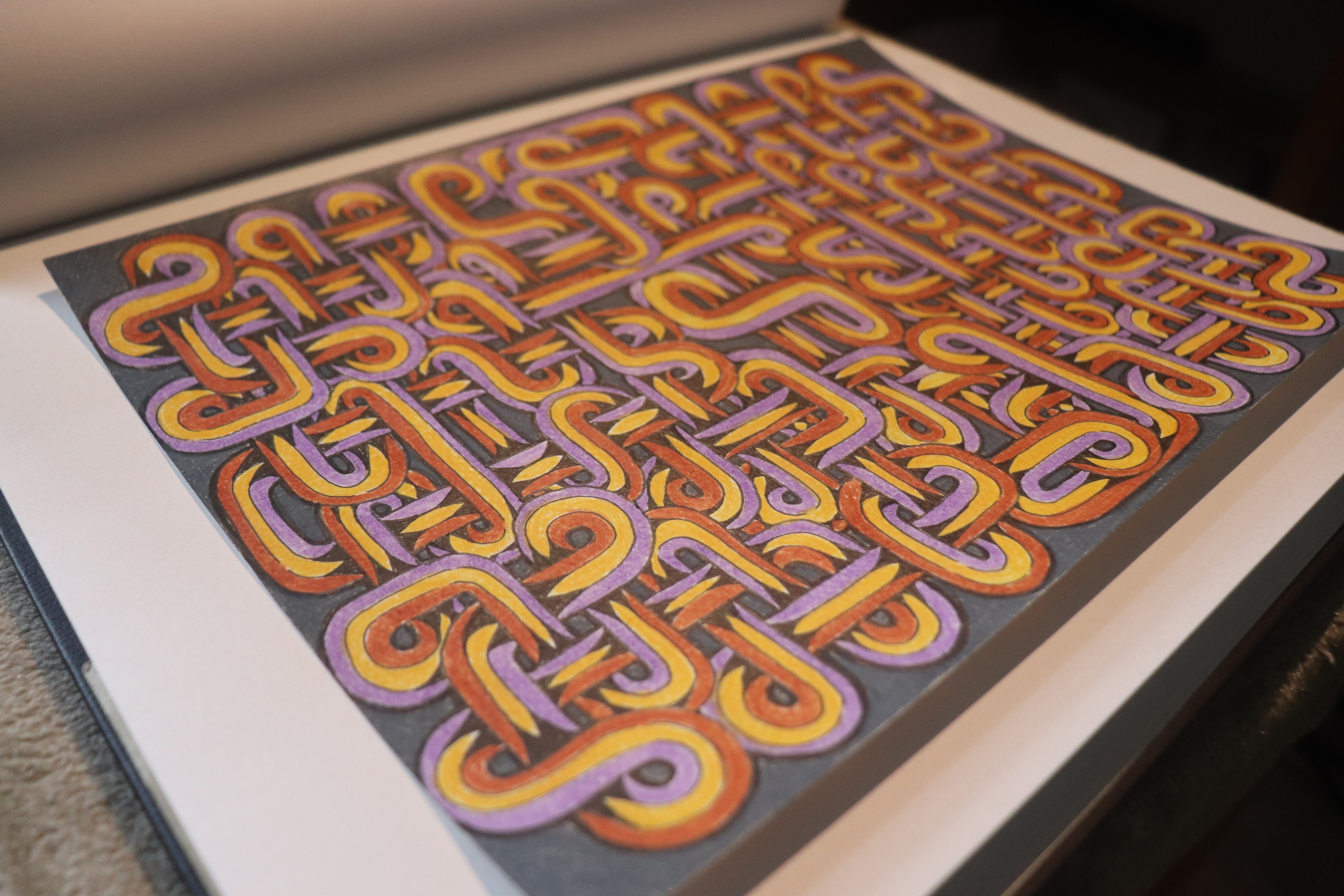
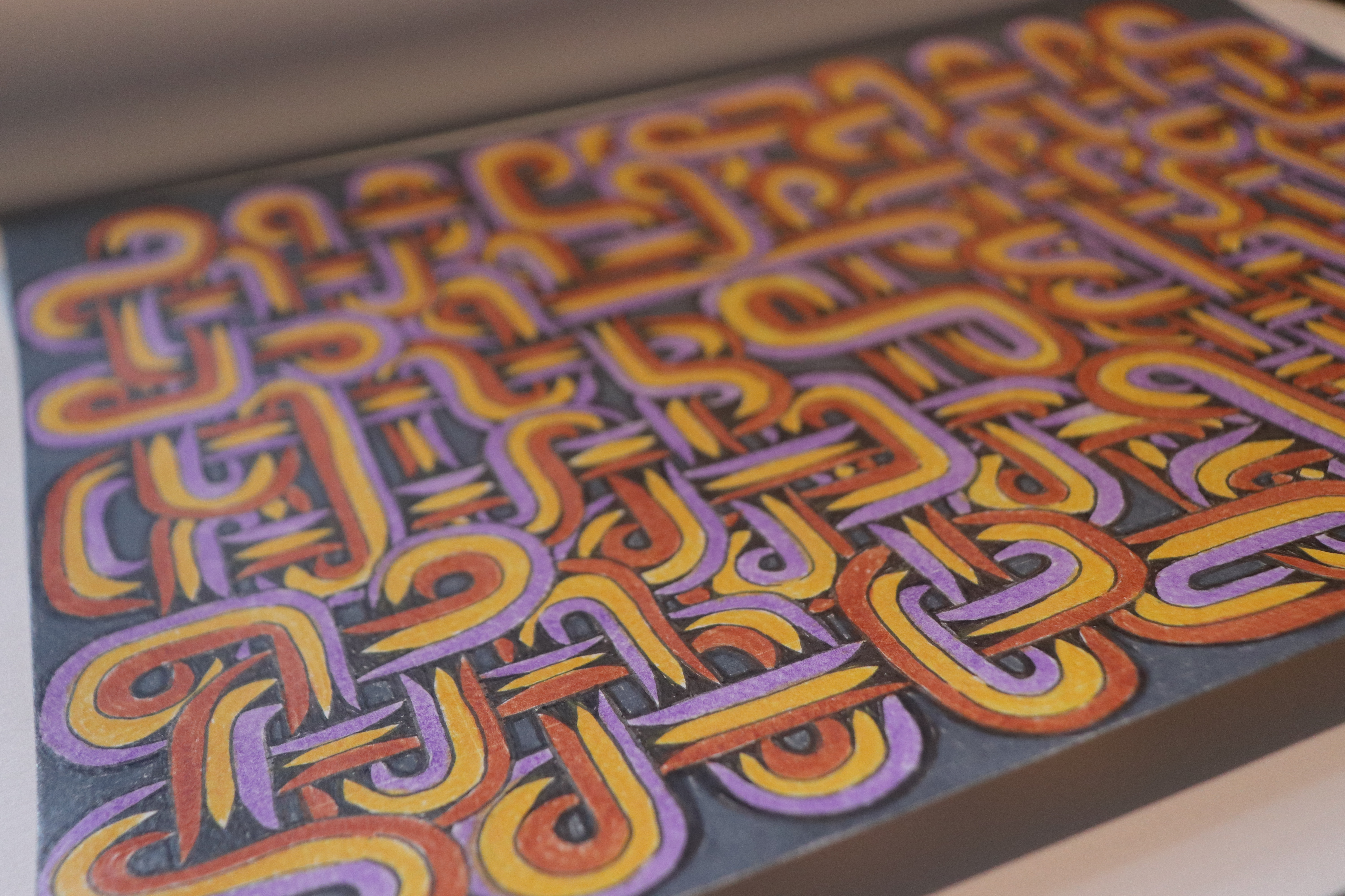
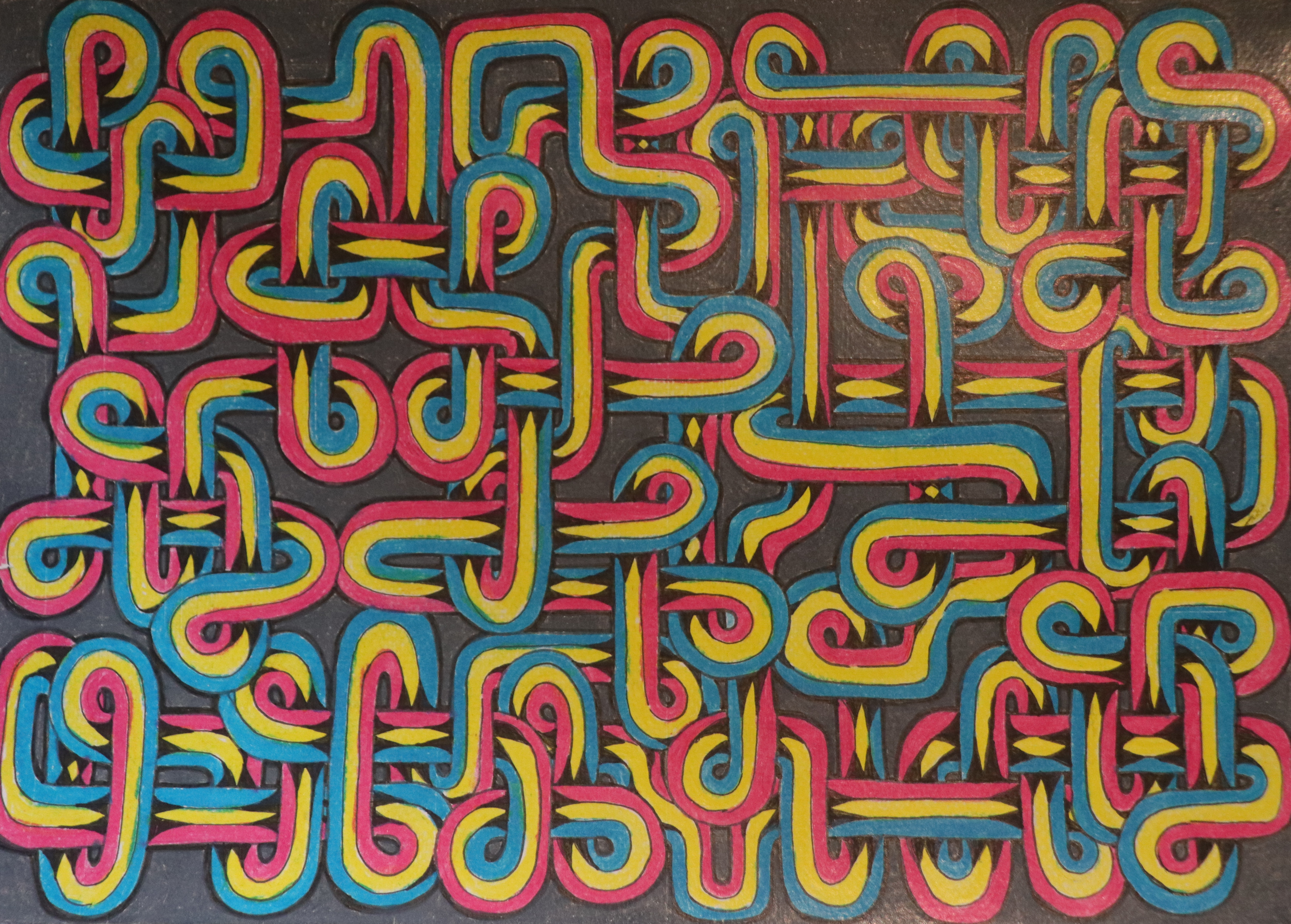
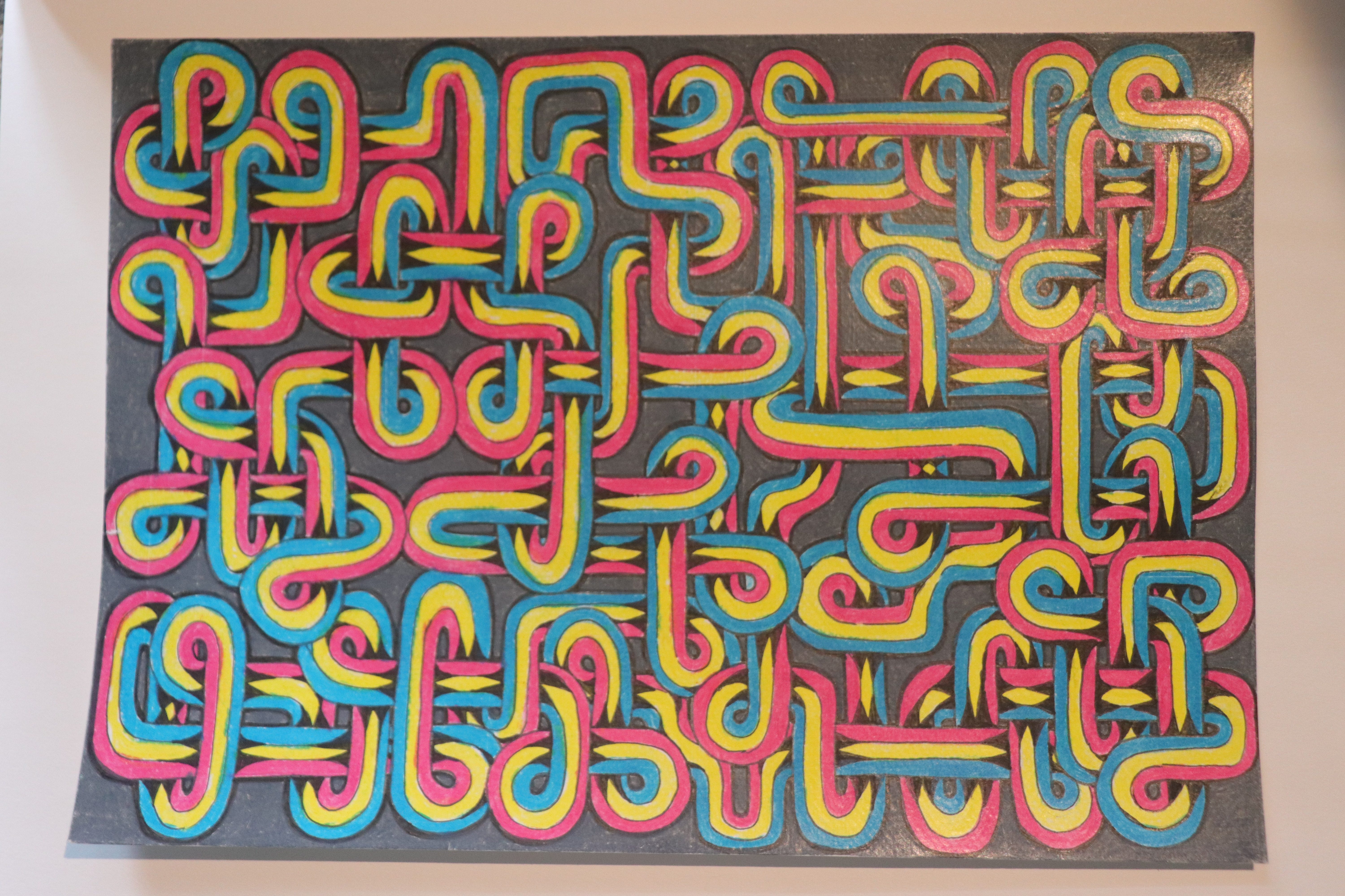
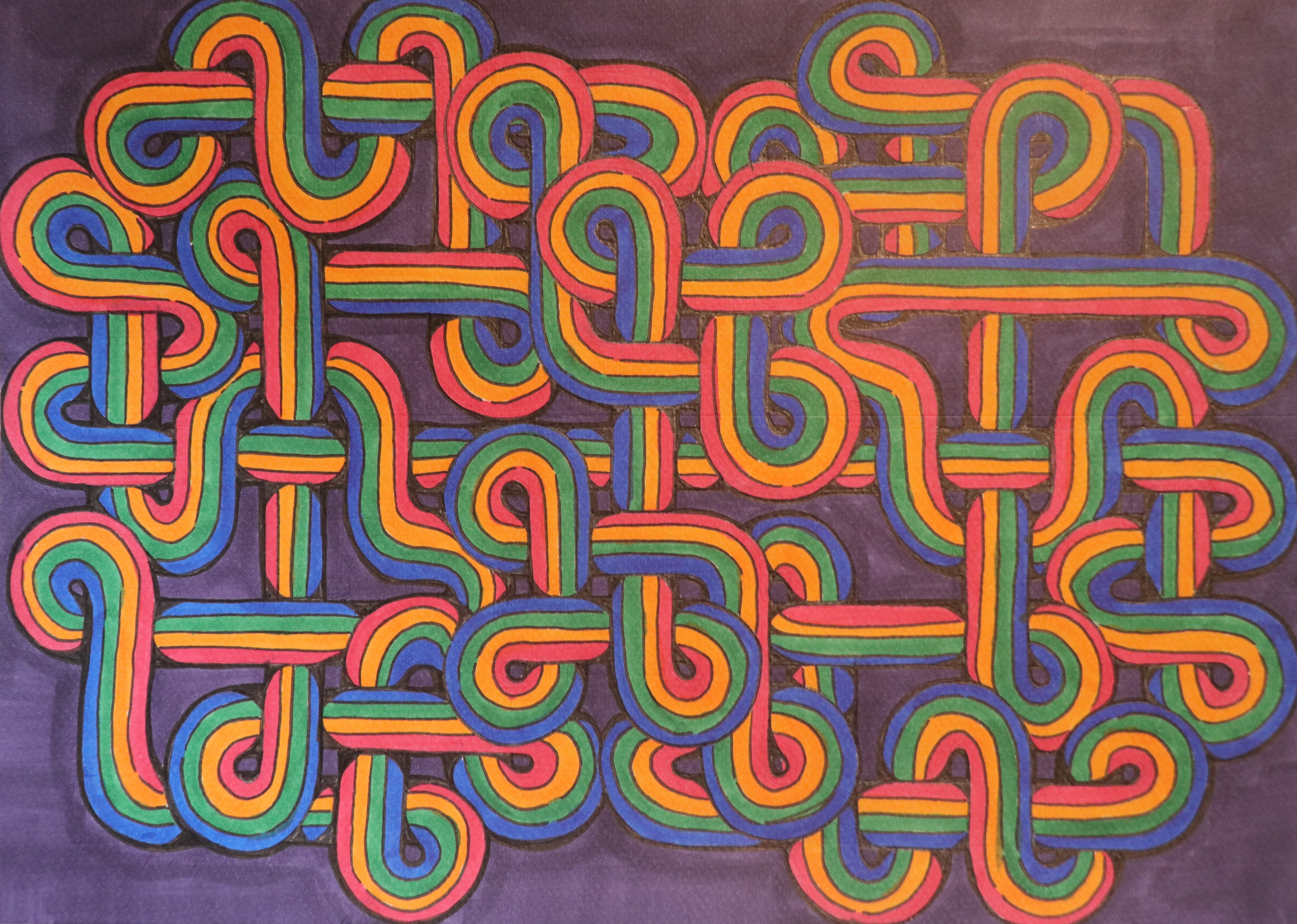
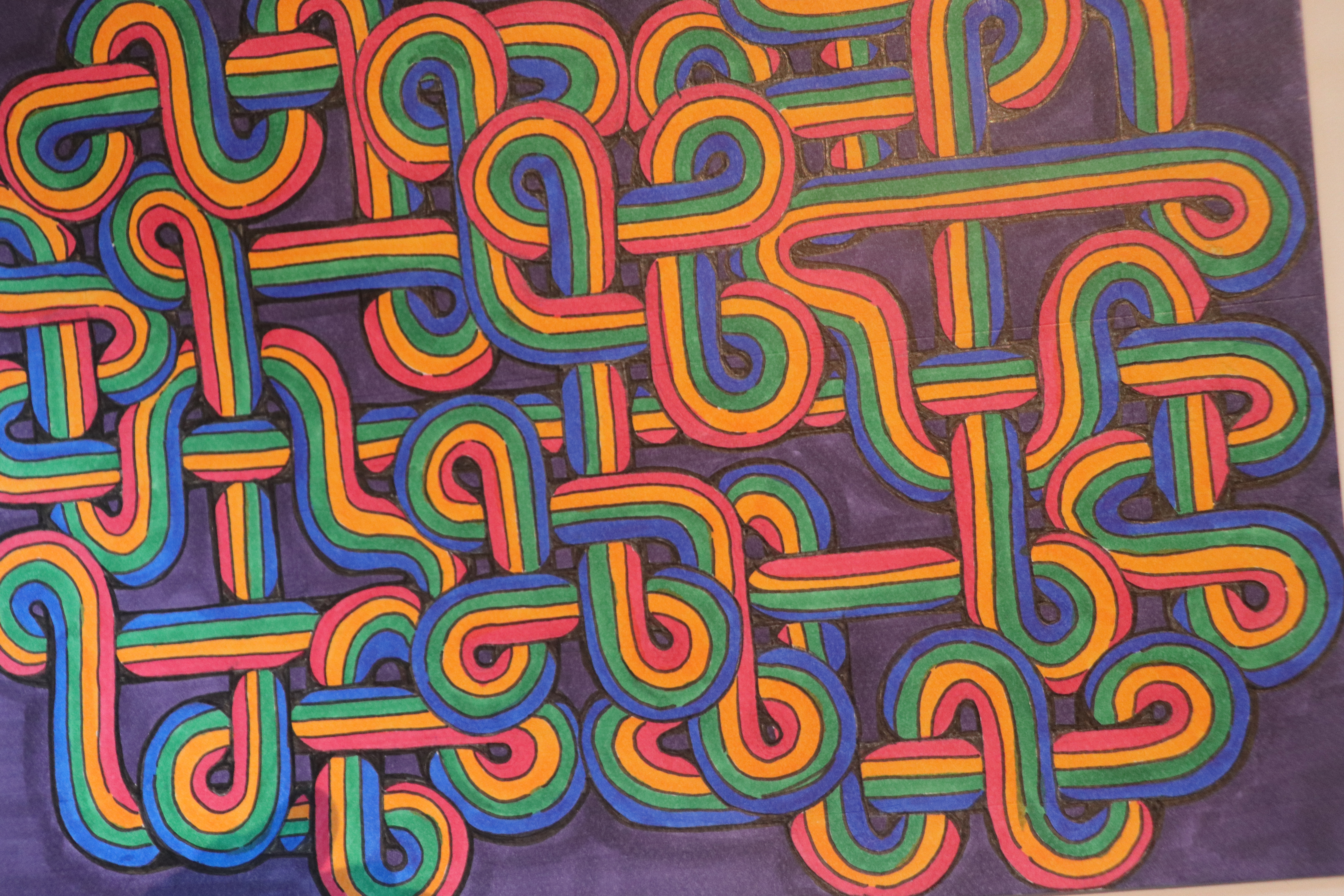
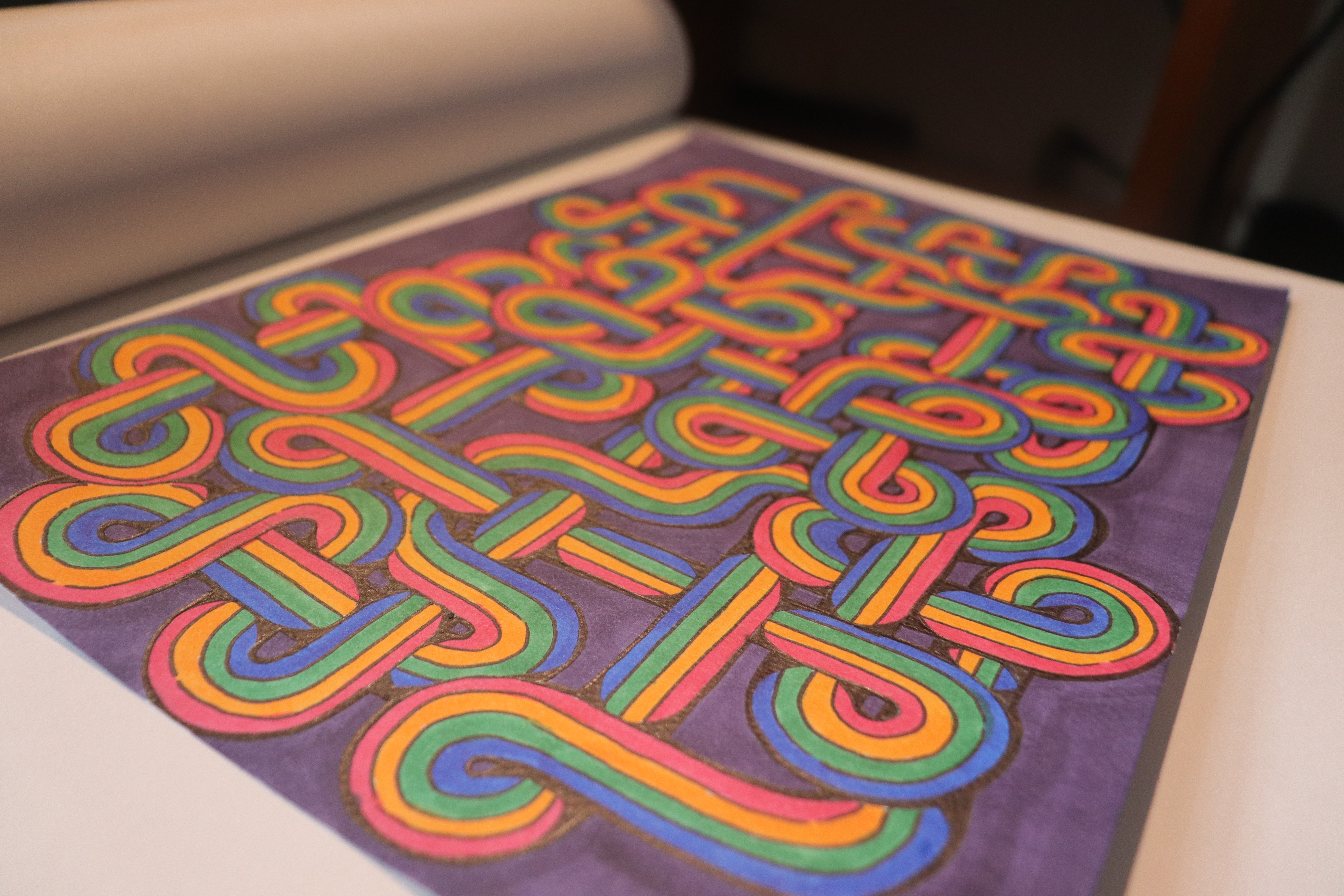
Three iterations of this idea are finished but none look quite the way I had in mind. The process
did get significantly faster but also I realized how important overlap is for this type of
piece. I wanted to add gel pen atop the last around the perimeter but I forgot I leant most of
mine out recently to a friend since I hadn't been using them.
Most of these were coloured using pencil crayons but the last iteration I started using copics
because pencil crayons were frustrating to get that clean bright look I had in mind.
April 2024
Back to the Top
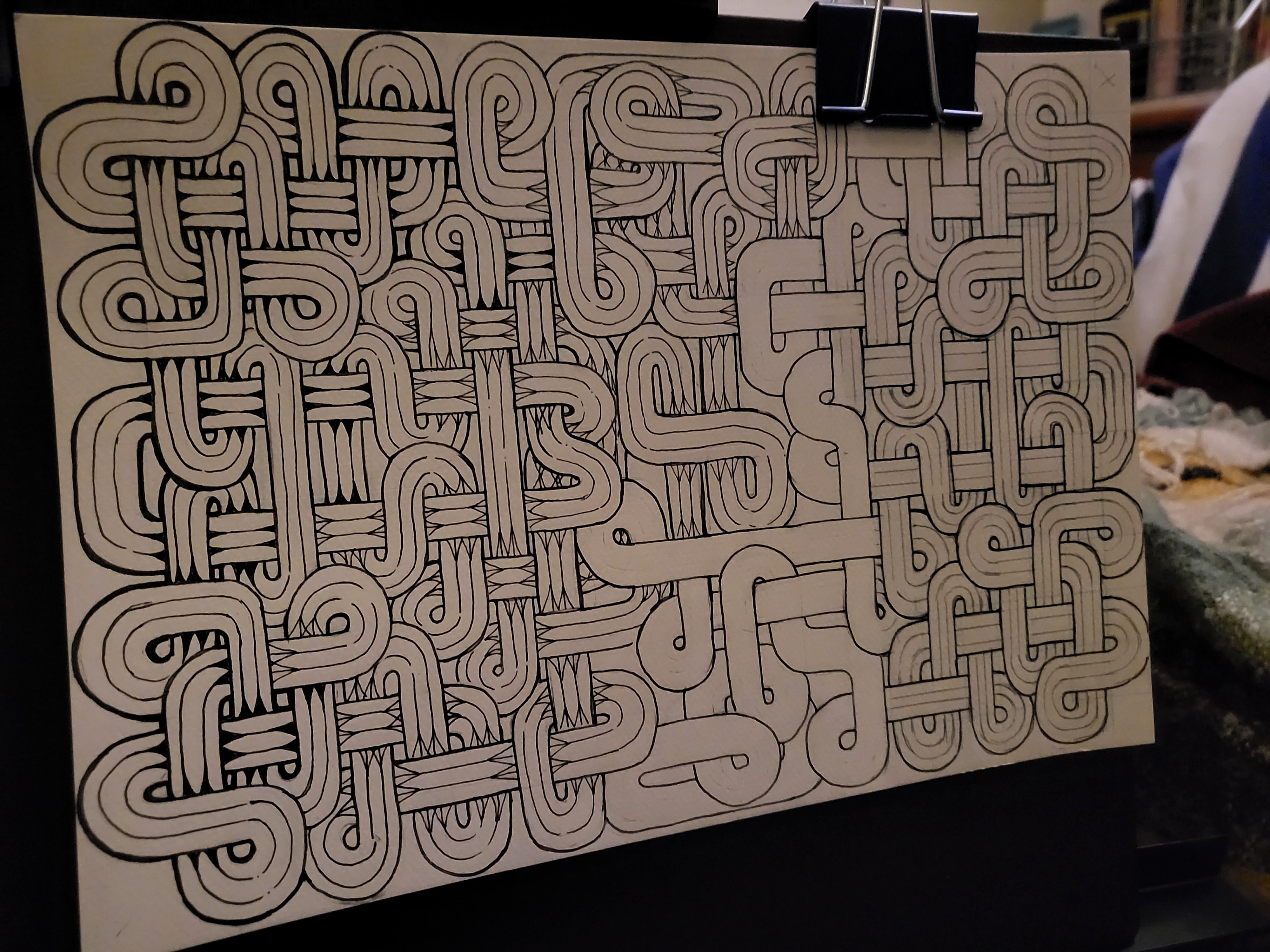
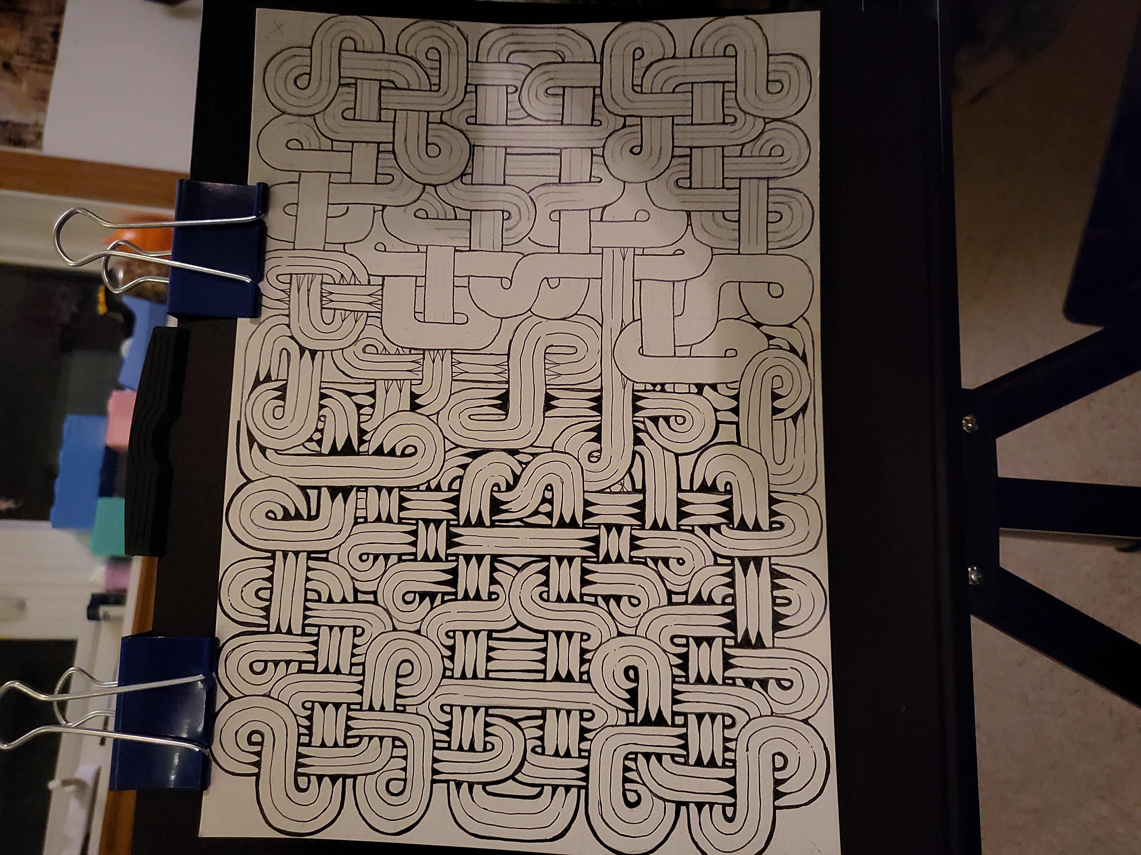
Loose Ends


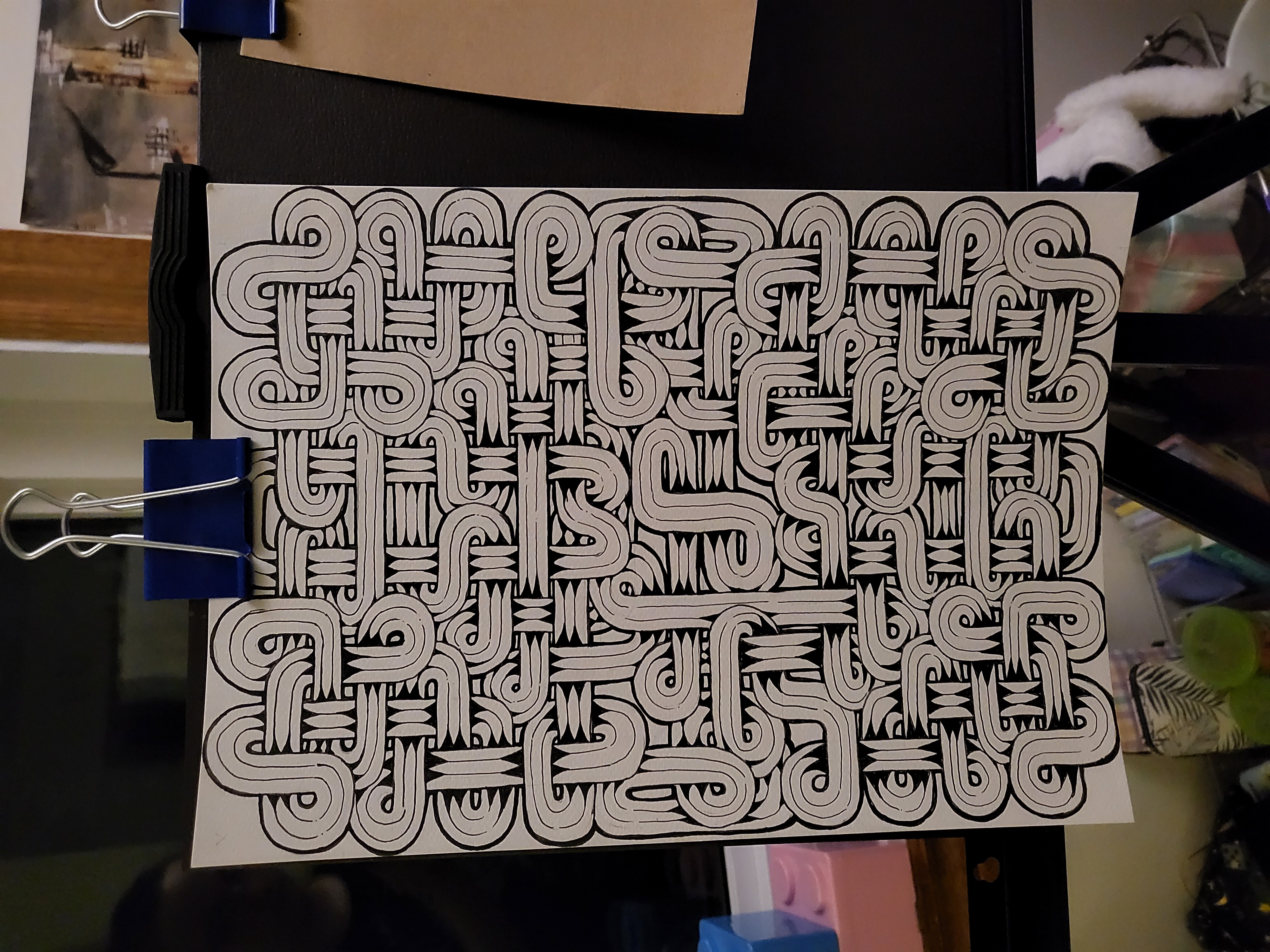
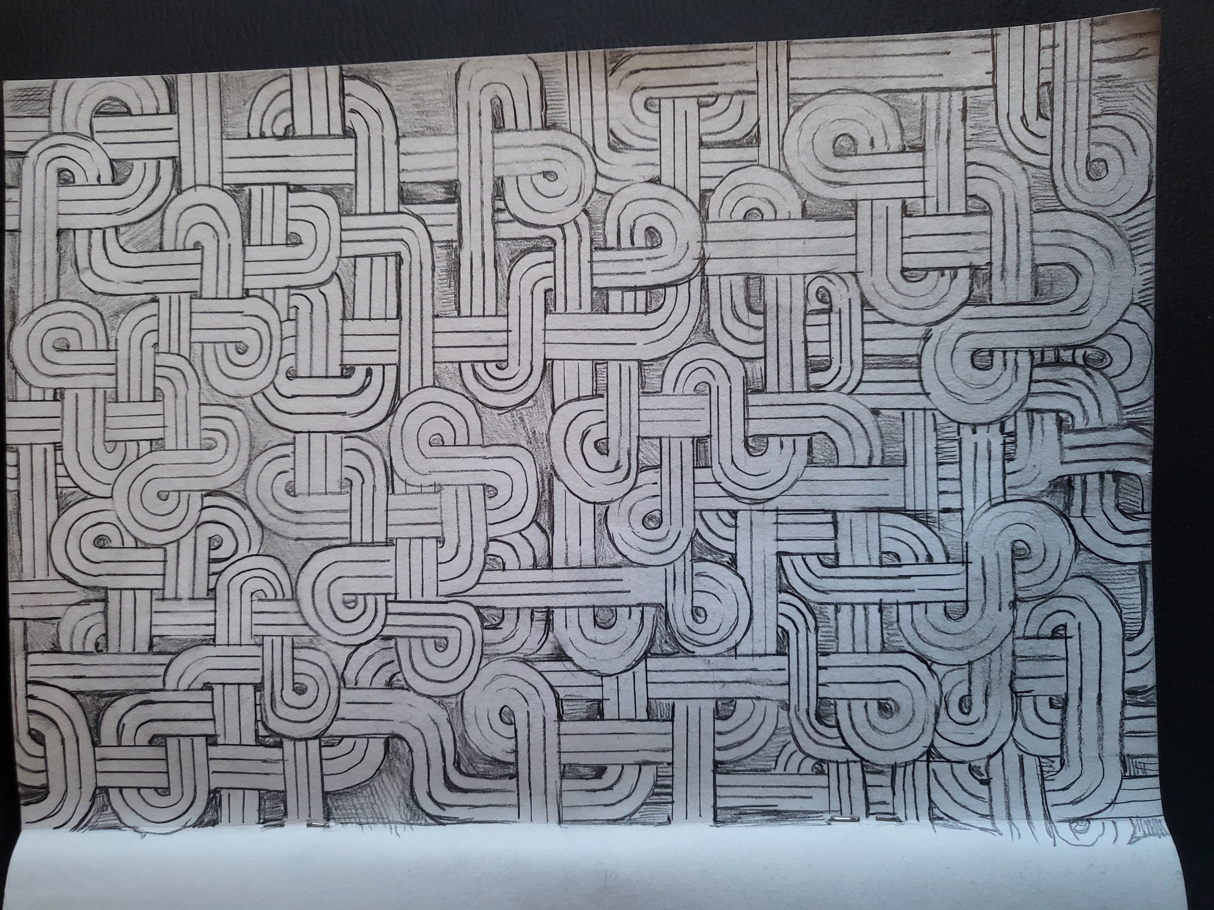
This was a labour. I started with a sketchbook page and then tried to replicate something
similar on nice paper but with more structure.
I first drew a grid in non-repo blue to keep the sizing more consistent (since the sketch was
free-hand). The first design I fucked up and then realized I wanted something that was
symmetrical and also a neverending loop.
This was the product of my second try once I had a frame of something symmetrical, but it is not
in fact a loop... nor is it actually symmetrical (onto the third try I guess).
If you look closely there are 2 strings that are unconnected and 1 looping one: making 3 in
total. It's still a work in progress since I'm adding some colour to it too. I will add an edit
here once that's done.
March 2024
Back to the Top
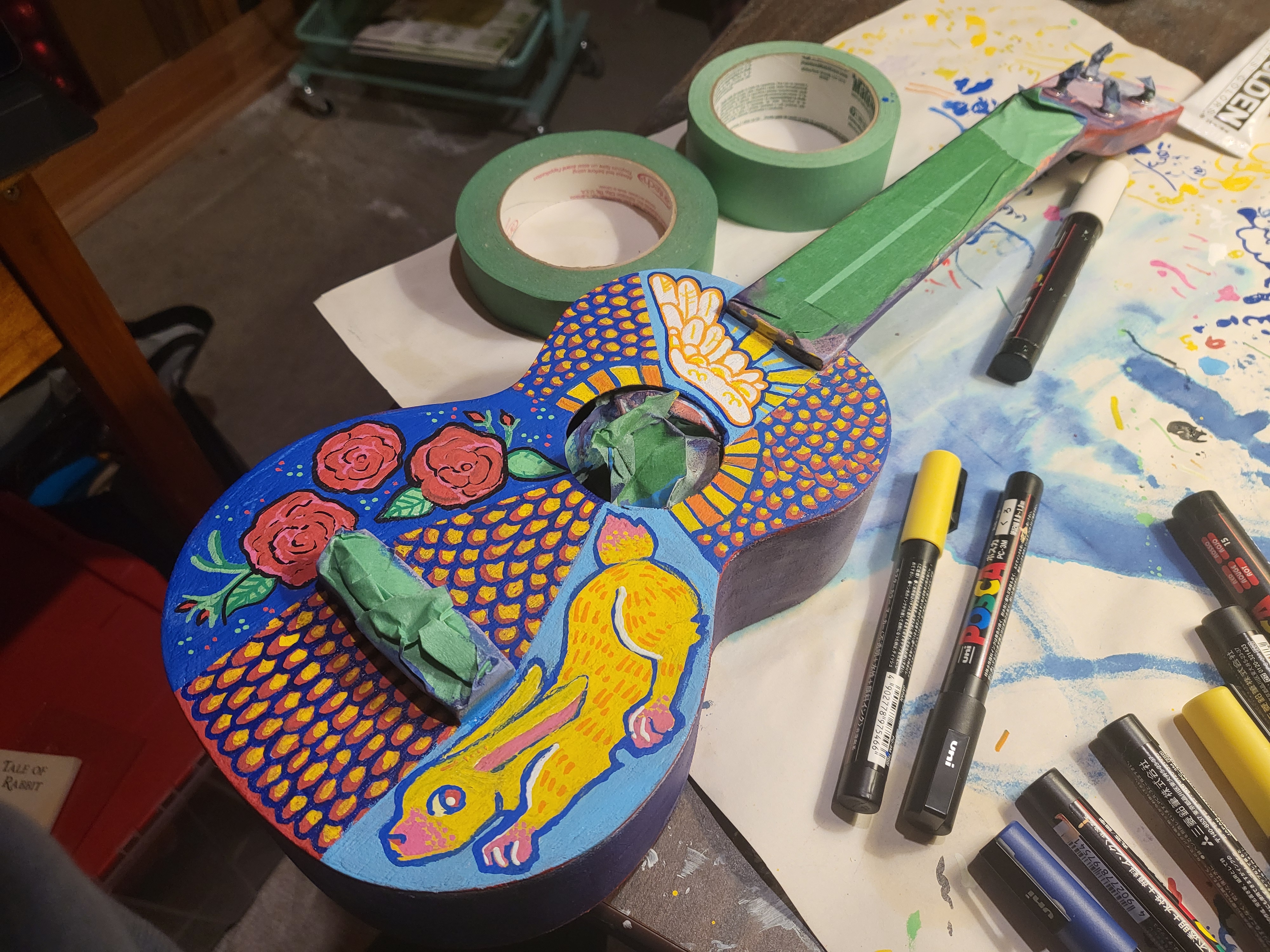
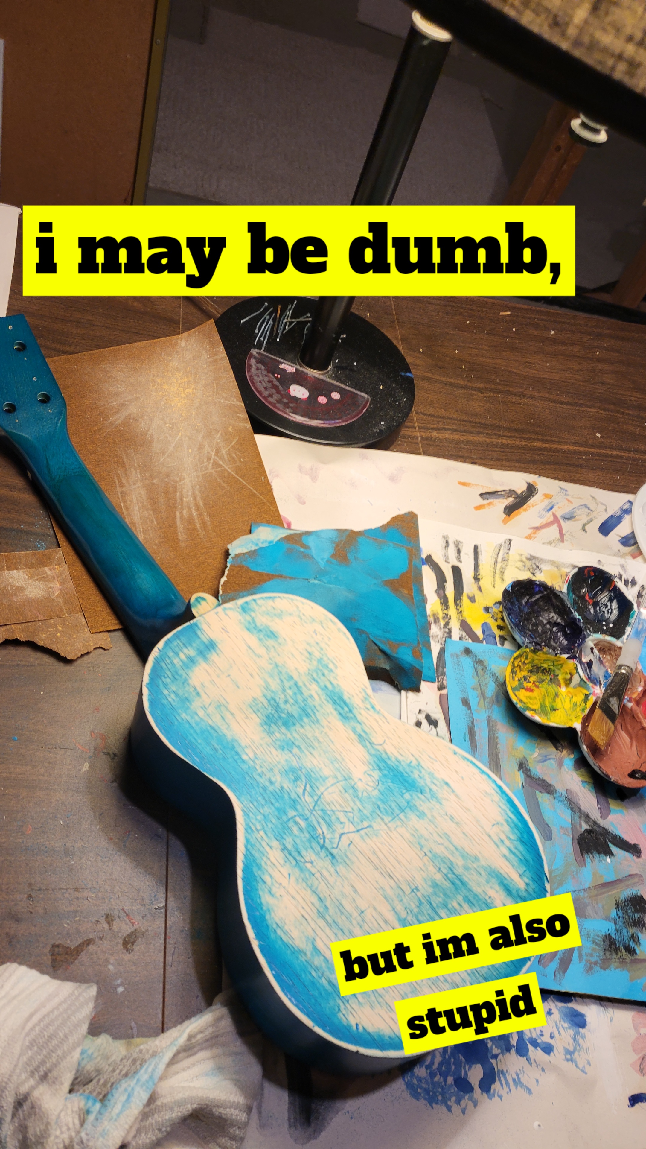
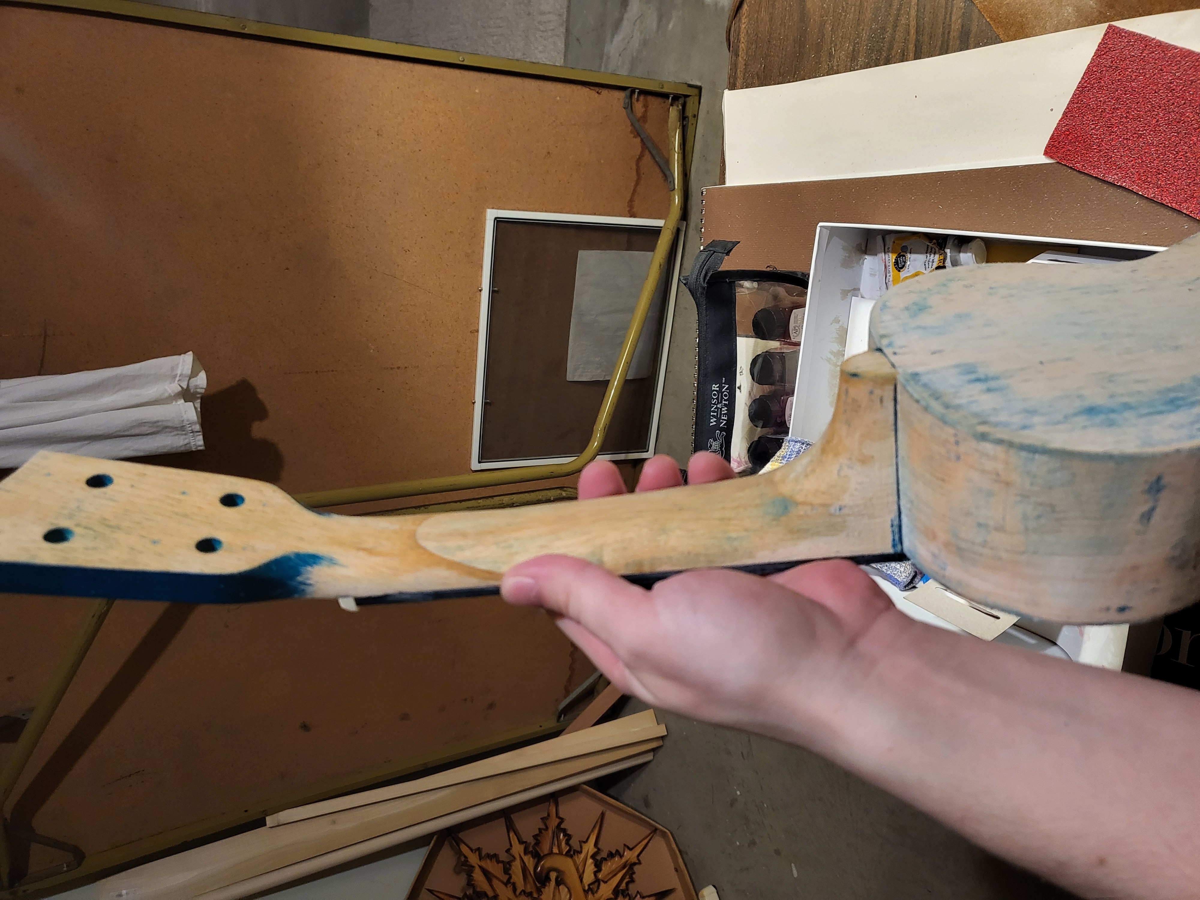
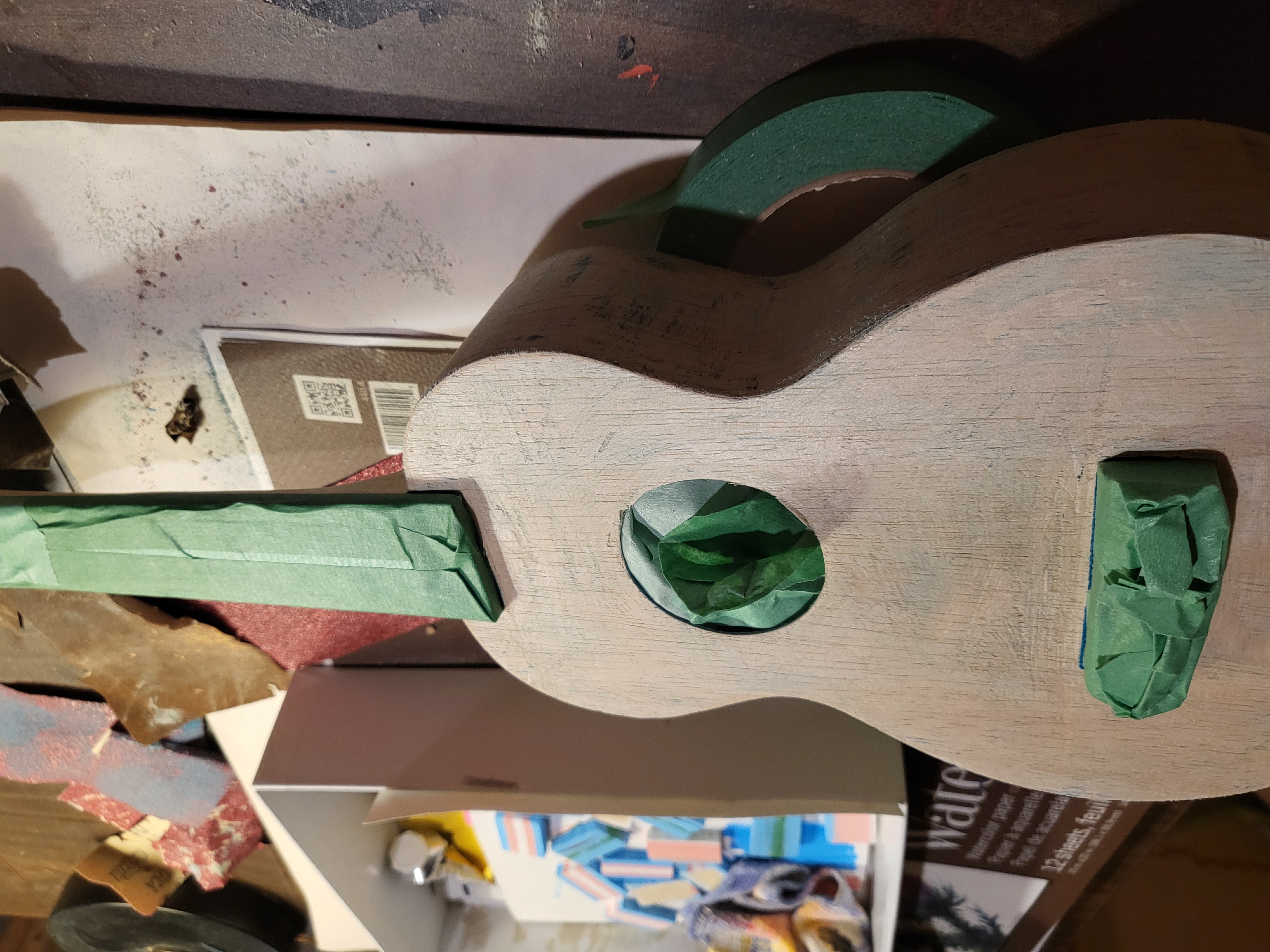
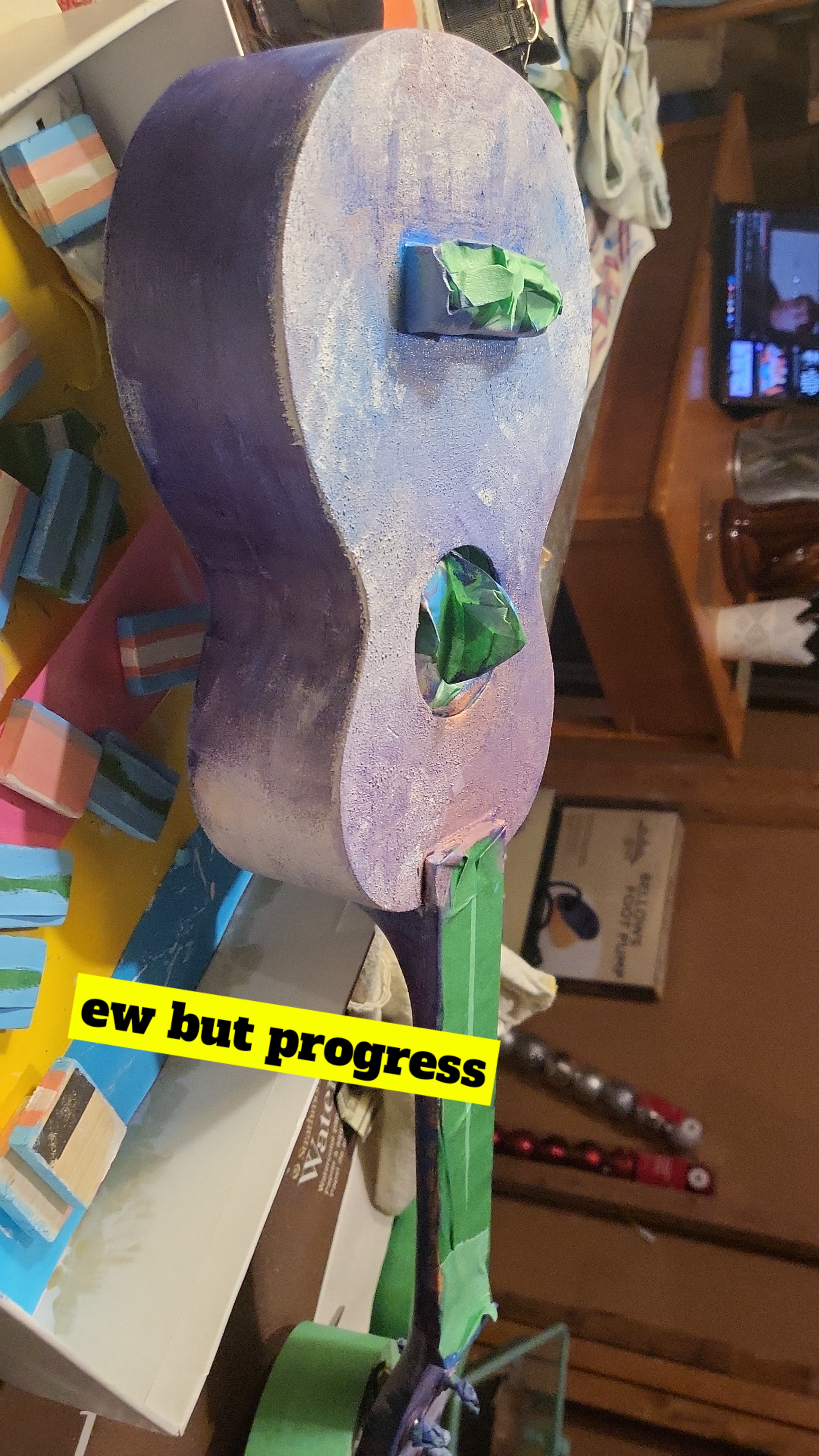
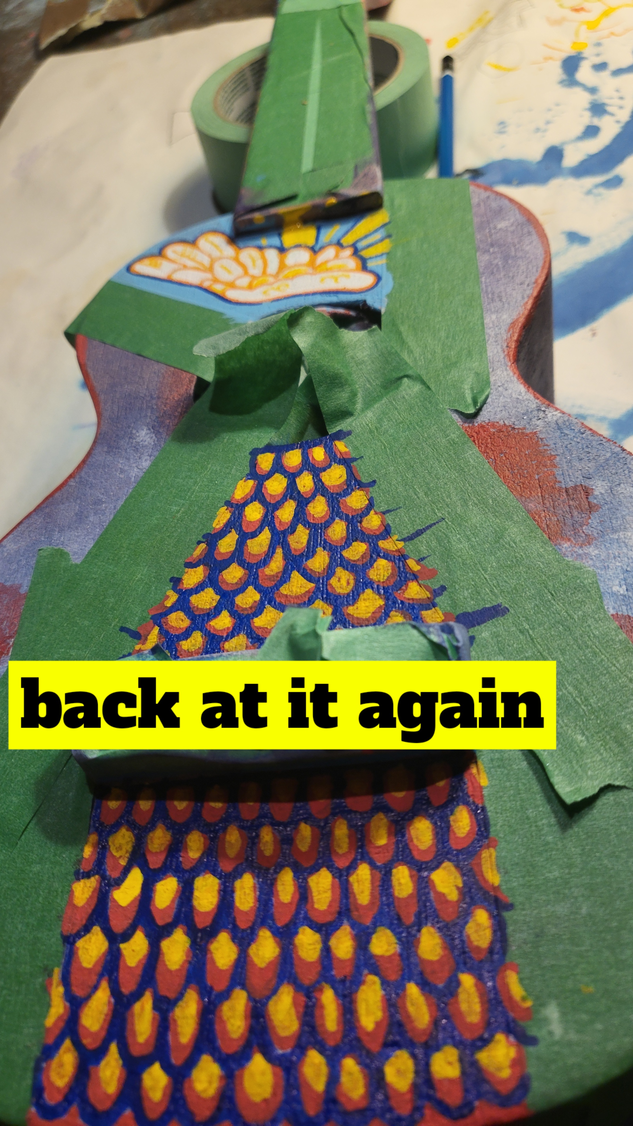
Ukulele Painting


She's naked... This process took a lot because I had the wrong kind of sandpaper for it
initially till I bought more.


The initial painting I did in acrylic I really disliked so I layered a shitton of posca
markers on the main body while leaving the back with most of the gradient acrylic showing. I
finished it off with a gloss spray that stank up the basement so bad you could smell it all
around the house.
I did restring it after it dried and it still holds up pretty well! I was
worried that leaving it unstrung for the whole process and all the pigments on it might warp it
too much to be played properly again but I was pleasantly surprised (though it didn't actually
fully dry for a whole week and the spray made it sticky that entire time).
Bonus is I finally got to put on Low G tuning strings on the thing and I'll never forget which
uku is mine.
March 2024
Back to the Top
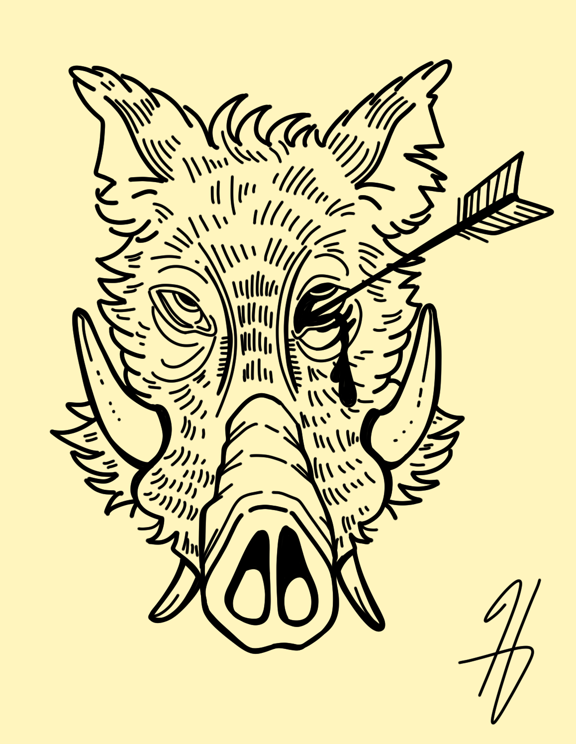
Boar Head

For this piece I used a 7px and 10px sized brush. I looked through a few pictures for reference
since I was a bit confused about the direction that the tusks and teeth should go in relation to
one another.
I think I'd like to try this idea again but with the classic decapitated imagery and from a
profile view.
Fun fact: boars under 10 monthes old are called "squeakers"
February 2024
Back to the Top
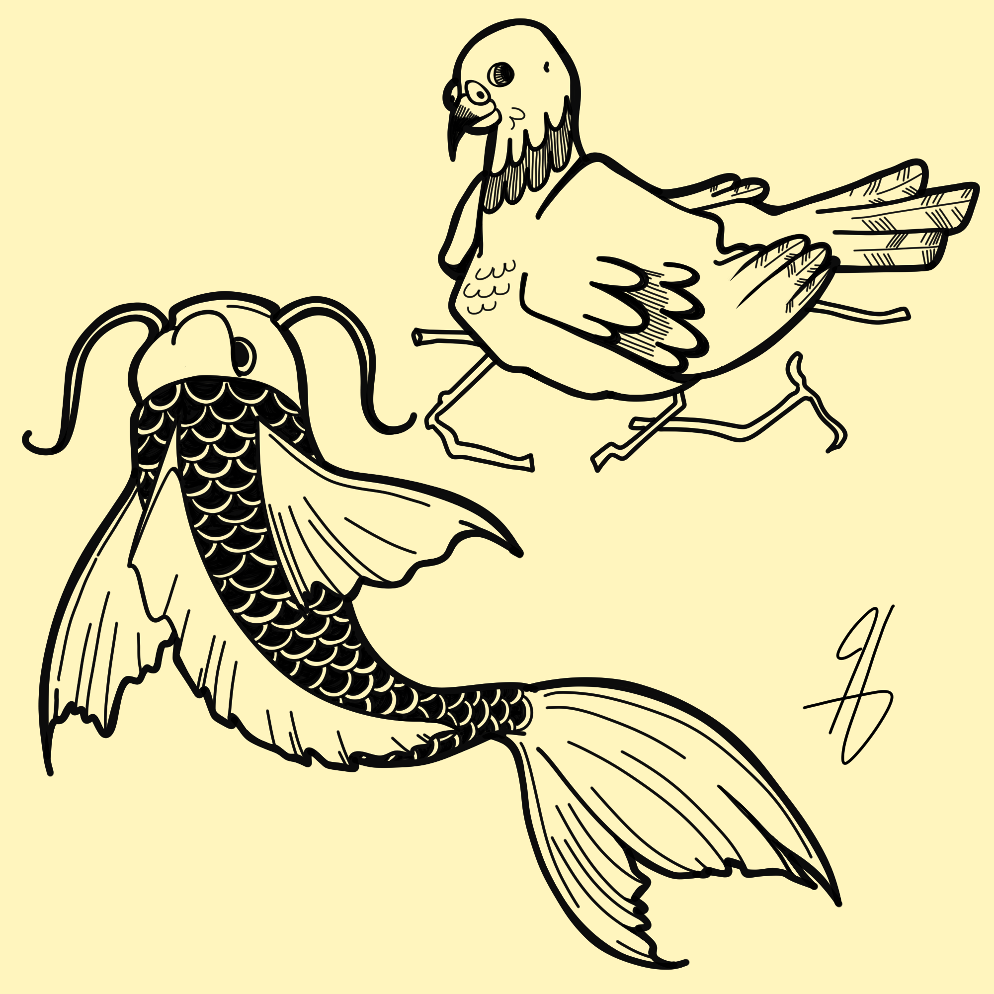
Pidgeon & Koi fish

Three brush sizes for the pidgeon (5px, 10px and 15px) while the koi fish only had 10px and 15px.
I'm actually most proud of the koi fish I think since the lines look a lot more cohesive than the
pidgeon. I think I shouldn't be using the zoom feature on clip when drawing because I get way
too focused on details that dont quite work (the feathers look out of place).
The koi fish reminds me of those fish kites more than a real fish but it's cute.
February 2024
Back to the Top
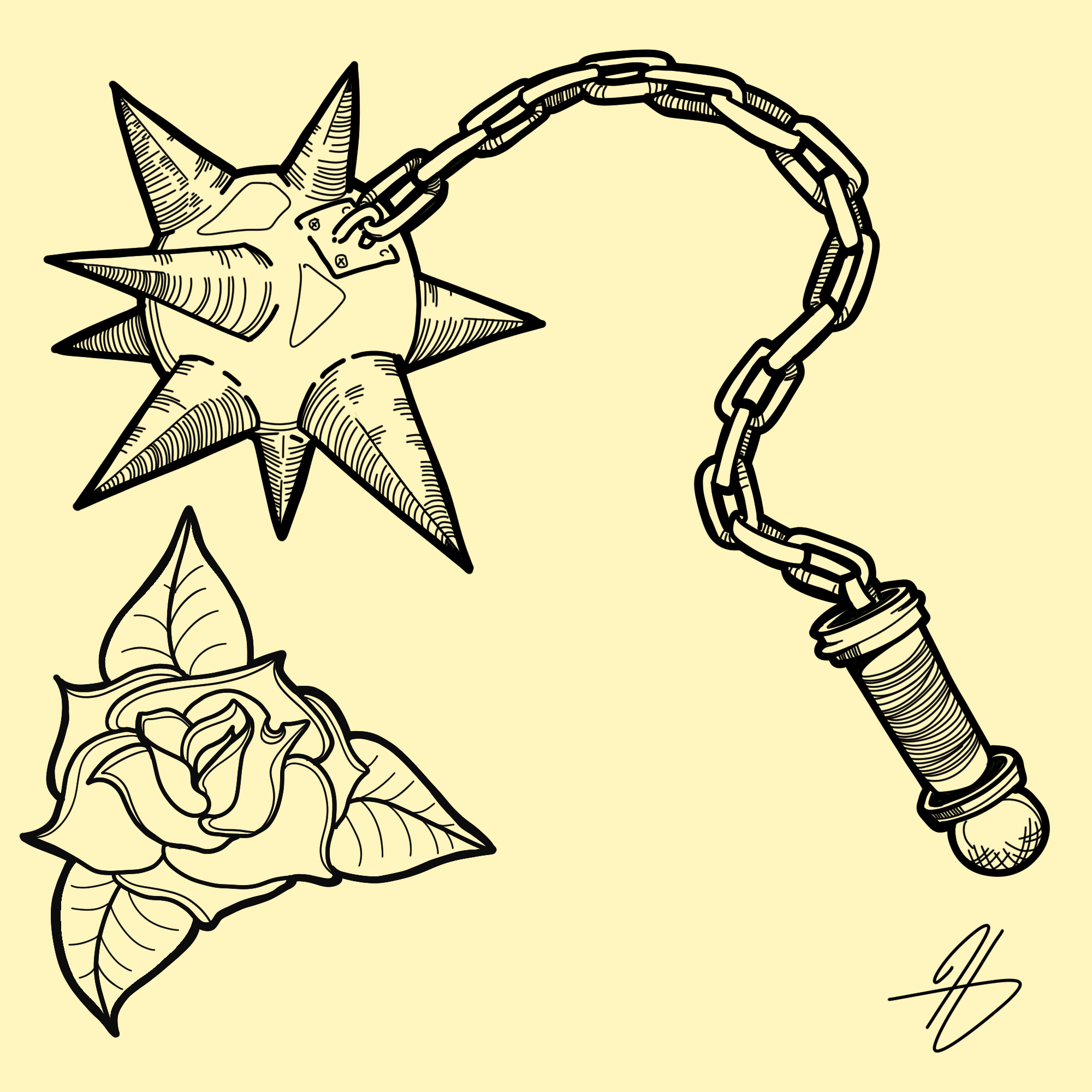
Rose and a Spiked Flail

Three brush sizes used: 5px, 10px, 15px (small details, main shape, and thick outline
respectively).
I like the flail more than the rose, but I think I'd want to redo the handle since it looks bad
in comparison to the rest. As for the rose I initially didnt like it but I think having the
small detail in 5px changed my mind in the end of the process.
February 2024
Back to the Top
January 2024


January 2024 things! And dumping more media. Will reorganize later
Jan 2024
Back to the Top
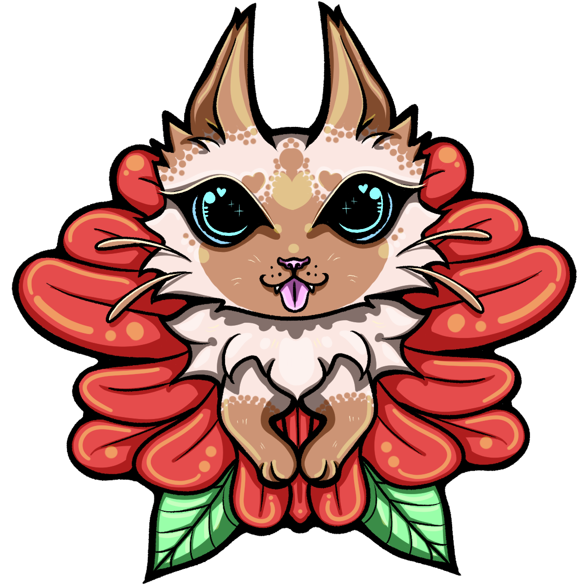
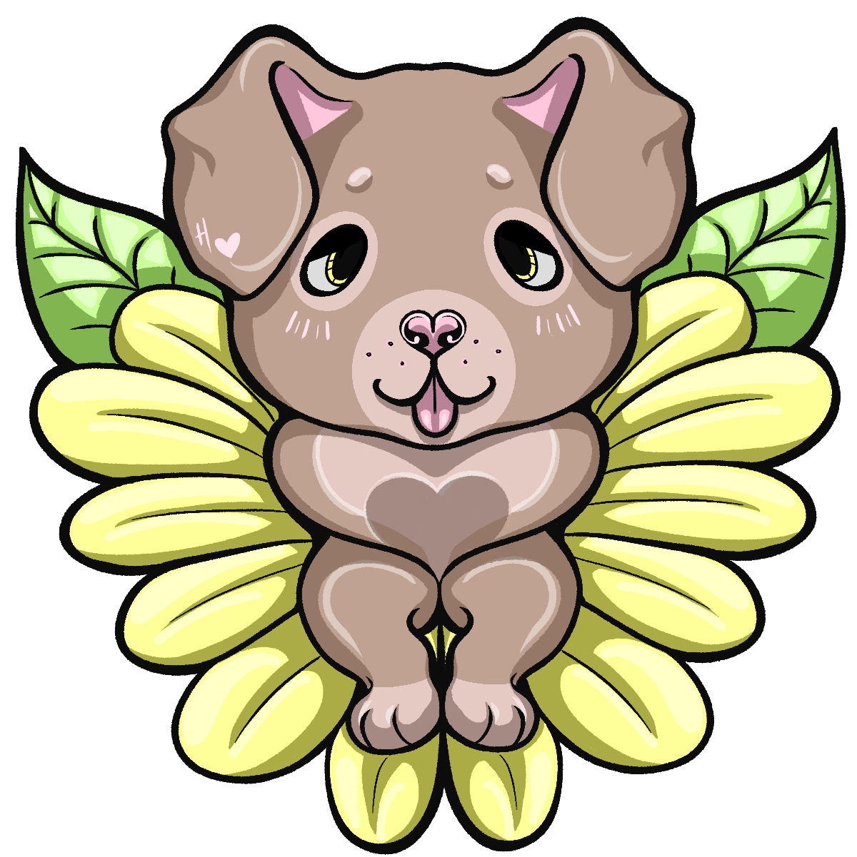
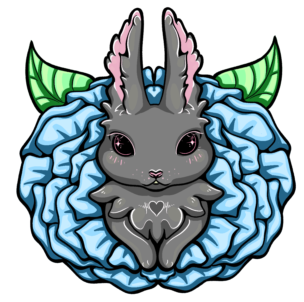
Pet Bouquet Designs


Designs made for stickers and keychains.
Three variations: Cat, Dog, and Bunny. Done in CSP (clip studio paint).
2021
Back to the Top
PORTRAITS


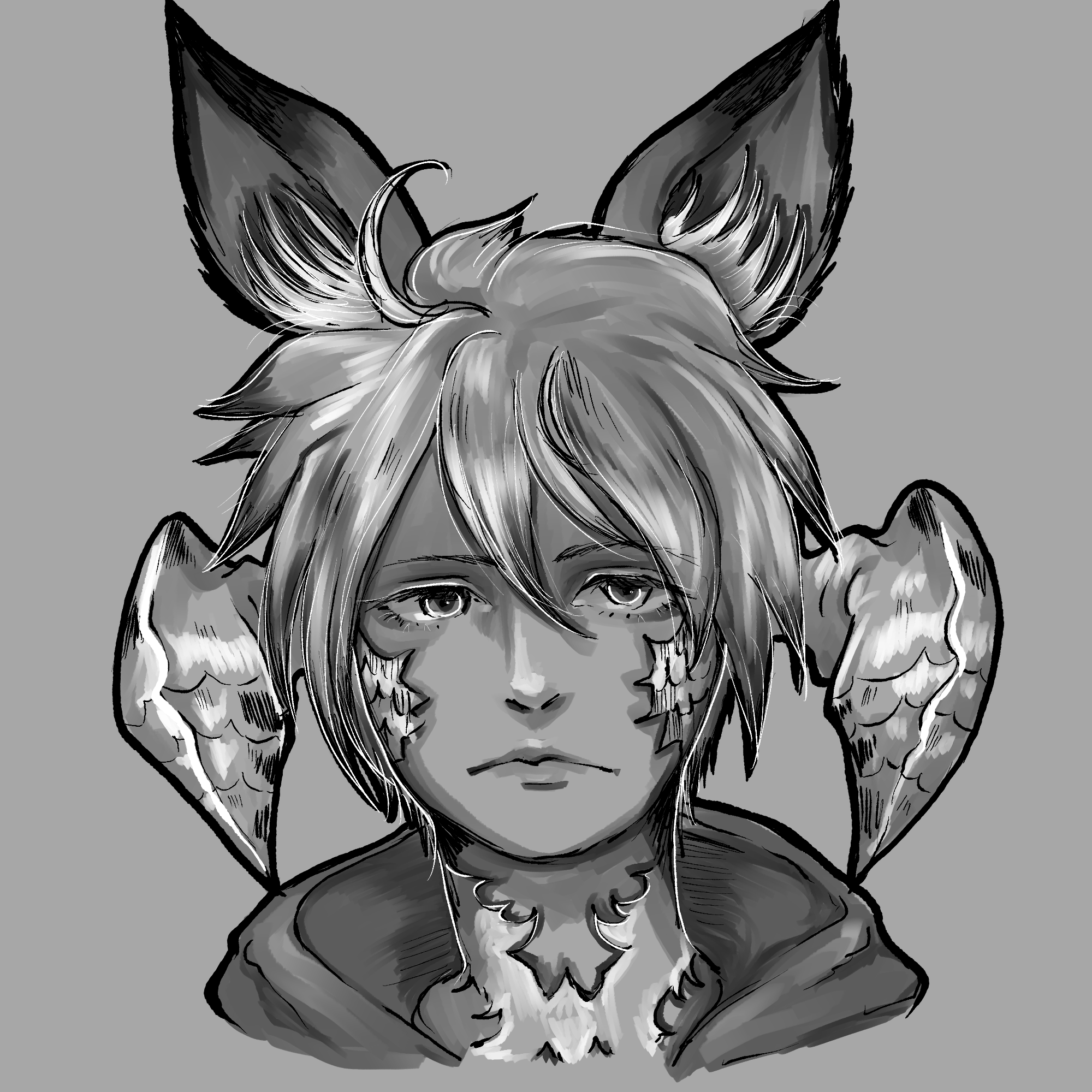
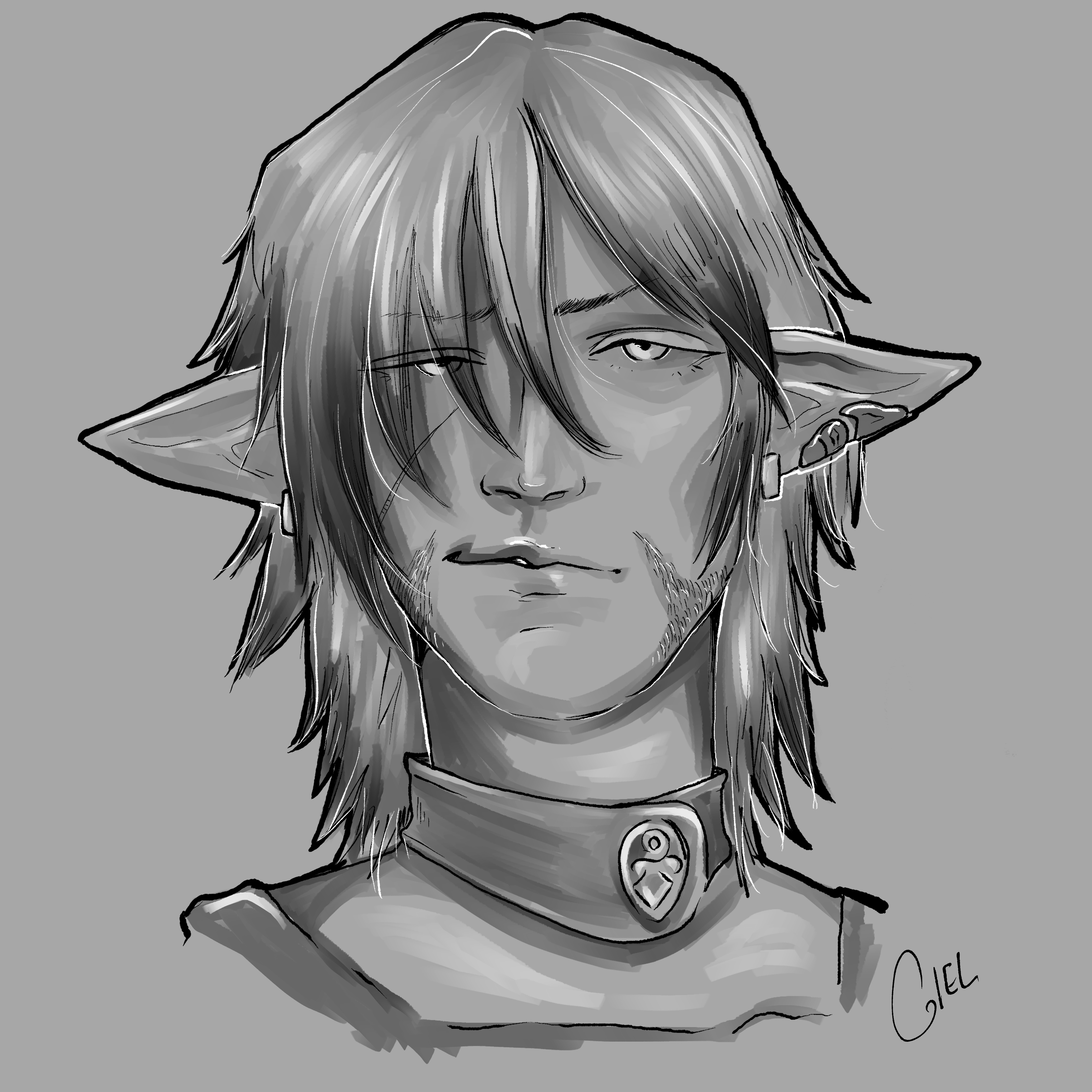
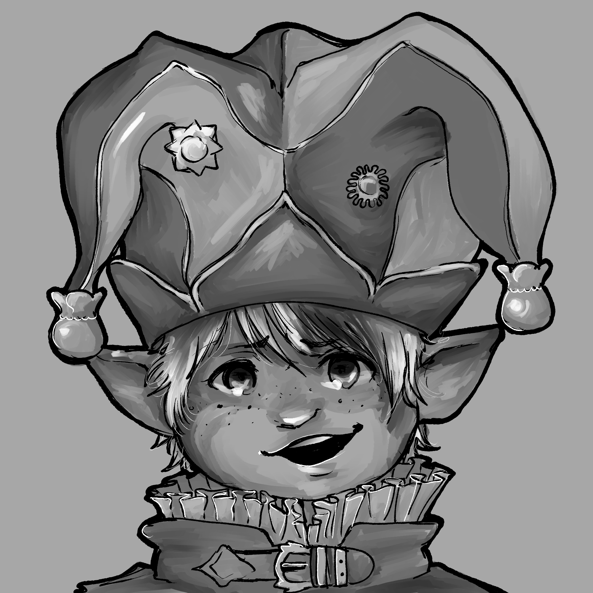
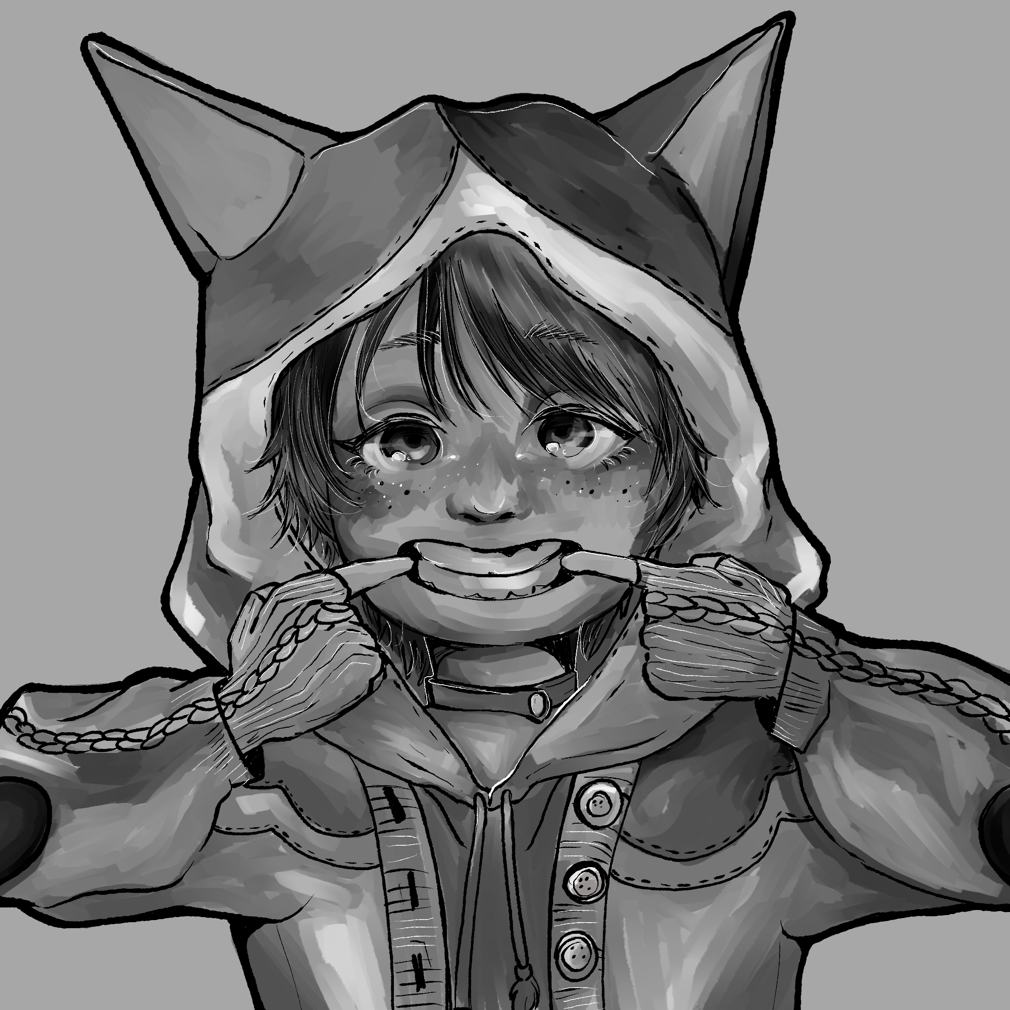
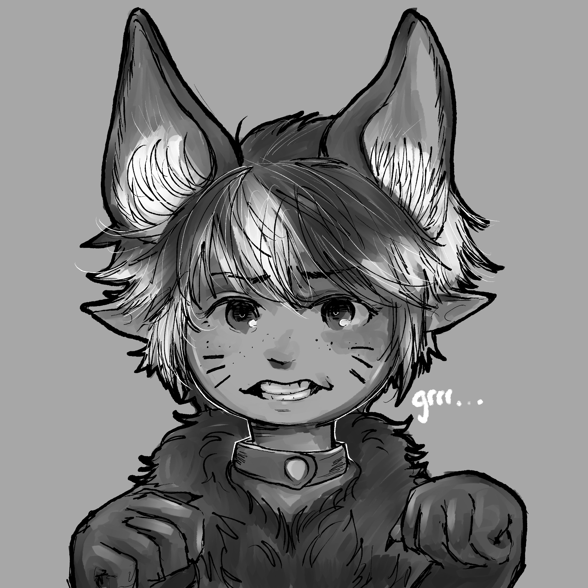
Final Fantasy XIV Character Flash Portraits
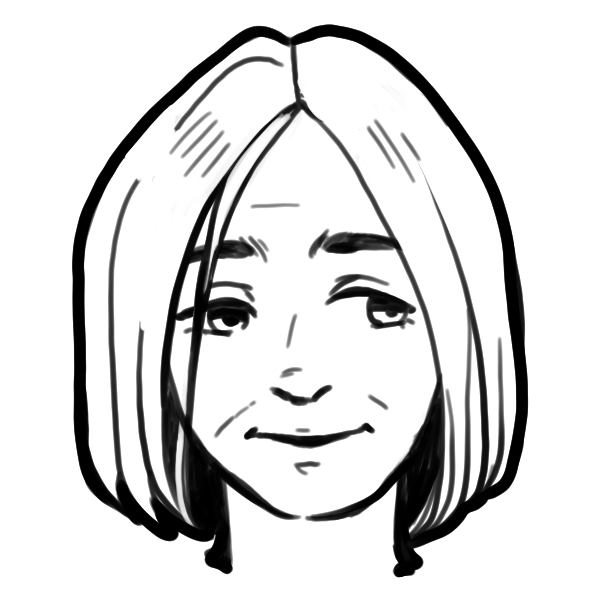
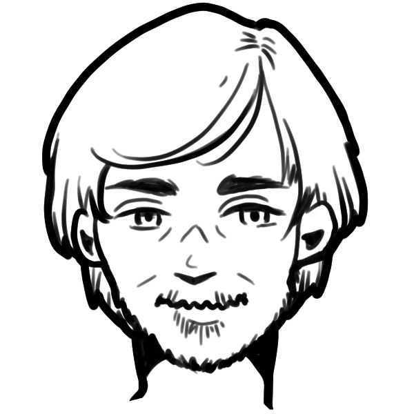
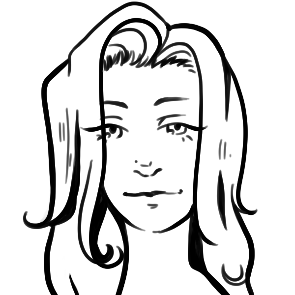
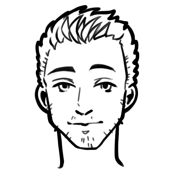
Portraits done in 60 minutes during cafe hours or as offline commissions. Watching the time
became paramount since I could only work so long at the cafe before I got tired. I felt like
I got
really confident towards the end in picking up small character design features and having a
good layer system in my sketches.
Sometimes I had to trust the process even if I wasn't 100% on board with my sketch, instead
it was always easier to build upon whatever rough I had rather than starting over like I
wanted to, and sometimes those terrible roughs end up turning into my favourite pieces.
2022-2023
Back to the Top
Sketch Dump

Some scrapbooked sketches.
2022-2023
Back to the Top
